
The place I work at is getting a redesign and I hate it. We all hate it. Nobody at the little fish level was consulted and it shows. I however have the slight advantage of being able to articulate why I’m so bothered by their design choices. I went down a YouTube rabbit hole recently that gave me the key words I needed, like “user-centered design” and “evidence-based design”. A much longer, more source heavy rant is probably coming at a later date, but here’s the mini version:
What is “good” design? For me good design accomplishes three things:
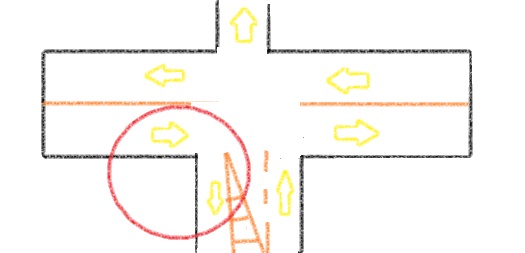
1) it’s Safe. I’m literally pulling the “safety first” thing, but I truly believe that safety should be the first and most important consideration in design. I hate my commute to work and to school because it feels dangerous to drive anywhere because the roads don’t feel safe. Thanks to the YouTube rabbit hole I know there are cost effective means of designing streets to make roads safer for cars and pedestrians. Another example I have from work is they repaved the road and whoever redrew the lines clearly had no idea how vectors work because at a three-way stop they made one of the lanes too narrow so that cars in the north bound lane trying to turn right towards the east were literally turning into the left turn lane for cars in the west bound lane. See hastily drawn visual aid below.
2. Good design is beautiful. I know people say that “beauty is in the eye of the beholder” but they’re probably mistakenly thinking of “taste” which is acquired through socialization. My “taste” probably isn’t going to match that of someone with a different socioeconomic or cultural background than myself. There are a lot of elements that I’ve grown to appreciate over the years, but when talking about “beauty” I’m referring to 5 basic elements that constantly retain viewer appreciation over the long term rather than elements that are subjected to “seasons”. The five elements are: biomimicry, ornament, curves, symmetry, and “ordered complexity”. Biomimicry refers to things we find in nature like fractals as well as obvious nature elements such as living plants and plant and animal motifs. Ornament is fairly self explanatory. Curves refers to things like arches and domes. Symmetry is also fairly self explanatory. Lastly “ordered complexity” is probably the hardest to achieve because you have to find the right balance between too little and too much. Although the amount of appreciation will vary from person to person, these are the elements that science says we like to come back to. A beautiful design is a sustainable design because it doesn’t have to be changed with the seasons.
3. Lastly good design is humanizing. We need to design things for humans with humans in mind. My earlier example of the bad paint job didn’t even have cars in mind when they divided up the available space much less people. Roads are safer when we make room for pedestrians and bikers. There’s an apartment complex right next to where I work. It’s a TWO minute walk from the apartment complex, but there’s no sidewalk to connect the apartment complex to the shopping area and it’s a 20 minute drive to get out of the apartment complex and take the main road. It’s so frustrating because it’s so fixable.
Circling back to why I’m so upset about the new look for my workplace and company. Originally the company I work for went for a “neighborhood” model, to where each store was unique and tried to integrate itself into the surrounding community. That was one aspect of the company I respected and lined up perfectly with what I learned both in class and from my YouTube rabbit hole. Now, however, the stores are all switching over to a universal design and we need to be “hospital clean”. Like, has anyone BEEN in a hospital recently? Even hospitals are moving away from the “hospital clean” look. Let me tell you, it was a LOOONG walk from the parking garage to my dad’s room in the ICU and every foot of that hospital was covered in ART from local artists. There was ART in the ICU room that served as something I felt I could anchor to in a very mentally and emotionally trying time. My doctor’s office has art in the examination rooms. There’s art in every room at the dental offices I go to.
The reason I’m so upset about the new look at my job is they are forbidding ornamentation and have taken down all the signage, they are removing all complexity and painting all the walls and doors the same bland color. I told my coworkers it’s giving “dissociating in a mental hospital”. The lighting with the new paint color makes us look tired (I mean we are because we’re healthcare workers but I don’t need a paint color to make it obvious). There’s nothing in the waiting area for customers to look at so if they’re not on their phones customers just staring at us the whole time while we’re trying to do our jobs. There also wasn’t a reason given for the changes other than someone “very high up” wanted it. Rolling out big changes without getting feedback first or giving an explanation of why the changes are necessary is a surefire way to alienate your workforce.
It’s unsafe, it’s ugly, and it’s dehumanizing. It’s a bad design.

Y’all have no idea how good it felt to write that all out.
LikeLike